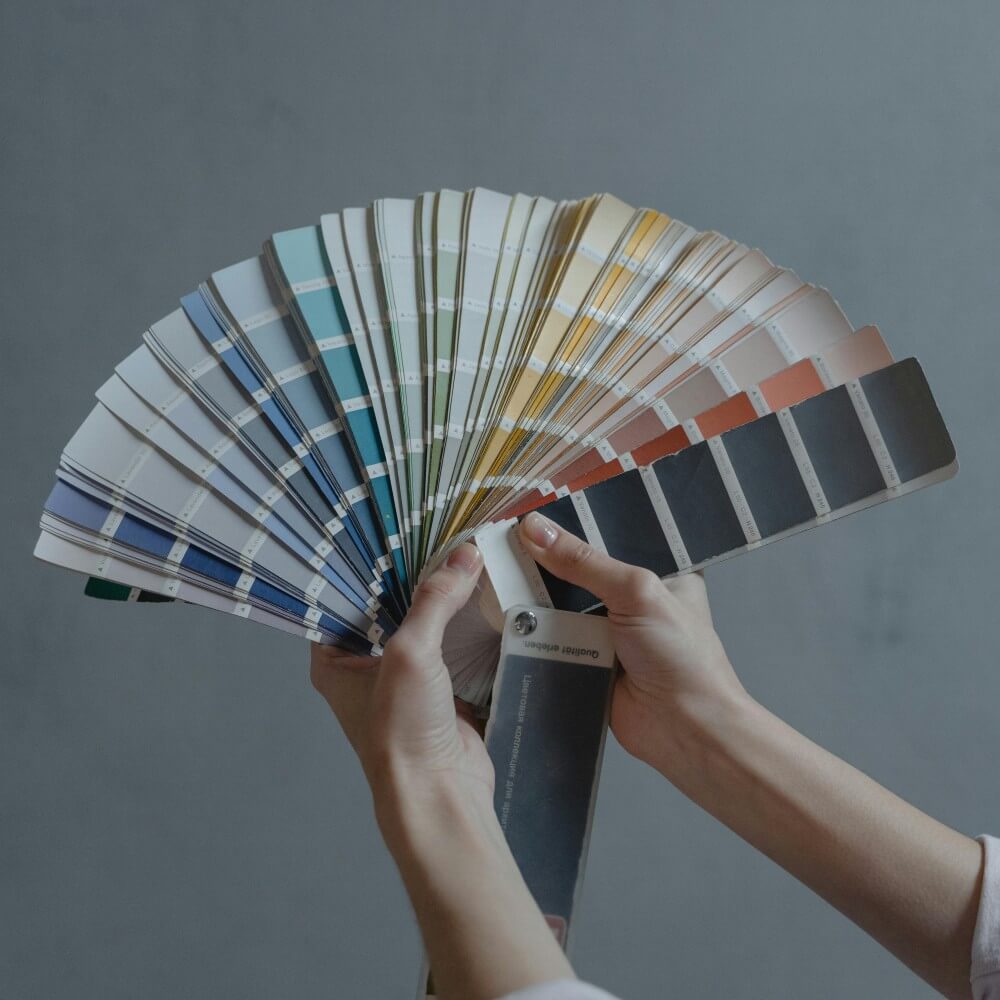
Discover how colour choices can shape user emotion and site performance.

Understanding Colour Psychology
Colour psychology examines how hues affect human emotion and behavior. In web design, this translates to creating engaging and emotionally resonant user experiences. Strategic use of colour can encourage users to stay, trust, and convert.
What Different Colours Communicate
- Red: Urgency, passion, and excitement — great for CTAs.
- Blue: Trust, stability, and professionalism — common in corporate and tech.
- Green: Health, growth, and eco-friendliness — great for wellness and sustainability brands.
- Yellow: Positivity and energy — attention-grabbing but use sparingly.
- Purple: Creativity and luxury — perfect for artistic or premium products.
- Orange: Fun and enthusiasm — excellent for youth-focused or energetic brands.
- Black/White: Elegance and clarity — used in minimalist or luxury sites.
Choosing the Right Colour Scheme
Know Your Audience: Different demographics react differently to colour. Cultural context matters.
Stay True to Your Brand: Your colours should reflect your brand’s identity and values. Consistency builds recognition.
Consider Emotional Goals: Decide what you want users to feel. Choose colours that support that feeling.
Use Contrast and Balance: Pair high and low-contrast elements for clarity and emphasis. Use tools like Adobe Color for palettes.
Test and Iterate: Use A/B testing to understand which colours lead to more conversions or better engagement.
Ensure Accessibility: Use colour contrast checkers to ensure your content is readable for all users, including those with visual impairments.
Real-World Examples
Airbnb: Soft blues and greens build calm and trust — aligning with the idea of "feeling at home."
McDonald's: Red and yellow encourage fast decisions and appetite stimulation.
Patagonia: Natural greens and blues reinforce their eco-conscious message.
Apple: Black and white reflect high-end minimalism and sophistication.